When I set out to design my first restaurant website, I thought I would borrow ideas from existing high profile restaurants.
But when I looked at these websites, with one exception, they were terrible. The most common deficiency was the extensive use of tiny fonts no one without a microscope could read. Imagine a shop with an entrance 4 inches high and expecting customers to flood in – it ain’t going to happen! Tiny fonts may look great but only 20 year old web designers can read them.
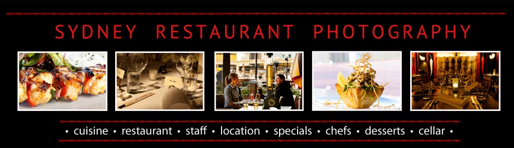
As for images, generally they showed restaurants with no one in them – I call this the Marie Celeste look. No one wants to dine in an empty restaurant, so why would you choose to promote the fact that your restaurant is empty?
When I talk to restauranteurs about their websites they generally have no idea how successful their websites are, i.e. how many visitors their websites receive a day. The conspiracy theorist within me thinks this is because web designers are embarrassed about how unsuccessful their concepts are in reality. i.e. if you spend $5000 on a website and it only gets 10 hits a day you might be unhappy. To help restauranteurs obtain website traffic statistics, they should know the information is free via google analytics and takes approximately 15 minutes to set up.
But enough preaching – to my latest website, http://www.nilgiris.com.au.

the home page of nilgiri's' website
Since the nilgiris’ website was launched three days ago, it has received 500 visits: the average time spent on the site is 4.01 minutes, 1845 pages were visited and 87.8% of visits originated in Australia. Not bad for a single location restaurant in suburban Sydney. In the same period (Monday to Wednesday which is generally the quiet time in the week for a restaurant), the website generated 10 restaurant bookings, 5 private room bookings, 4 catering enquiries, 1 function enquiry and 6 general enquiries. Again, all this information is free of charge via google analytics.
If you really want to obsess about web traffic, you can!

site statistics
So why is the nilgiri’s website doing well? Here are seven reasons.
1. easy on the eye
First of all, the nilgiris’ website is easy on the eye – not cluttered, inviting colours and there is extensive use of photos which allow visitors to feel they can objectively assess the site.
2. easy to navigate
Secondly, the nilgiris’ website is very easy to navigate with each page generally accessible using one of three alternatives.
Visitors can use the search bar in the top right hand corner of every page which is helpfully titled ‘search this website” and uses large text. Or visitors can select the drop down menus which are generously proportioned, taking up the entire width of the website so people can easily read and then select them.

drop down menu
Visitors can also access the most popular pages of the site by clicking on them at the base of each page.

popular pages accessible in the footer of every page
3. no dead ends
Thirdly, visitors stay on the website, because very few pages are dead ends – they offer additional relevant pages for the visitor to check out e.g. the cooking class page has four buttons on the text window to the right of the main image: faq, book now, cooking class schedule and resume slideshow.

no dead ends
4. friendly forms
Fourthly, the nilgiris’ website receives many bookings is because the booking forms don’t demand excessive and irrelevant amounts of information, (e.g. your postcode and country) they don’t have impossible anti-spam measures and they use large text.

user friendly anti-spam filter
The website also understands people want feedback so it offers one hour turnaround for enquiries – why on earth would anyone use a booking form that promises to get back to you in 24 hours?

legible contact form that resounds within one hour
5. Extensive use of images
Fifthly, the website revolves around images – I often think that the average web designer doesn’t really want the client to spend money on photography as it means less money to spend on fancy graphics and fonts – hence mediocre images are often used.

images of people having a good time
6. An engaging experience
The nilgiris’ website isn’t a dull static experience. This means the landing page isn’t a tedious flash movie that takes an hour to load and 30 seconds to watch. Instead, most pages have an automatic slideshow which is easily controlled by the visitor. Incidentally, the slideshow has a large image with text on the right hand side – too many slideshows have a tiny pop up text window which is difficult to read so why not have a decent text box to the right of the image?
The website is also fast to load – this is because the images are optimised for webs and flash isn’t used. To objectively assess how fast your website is, use free tools such as google’s Pagespeed and Yahoo’s Yslow.
The nilgiris’ website website wants new users to subscribe to the monthly newsletter but the invitation only pops up after the visitor has looked at three pages and remembers the visitor so they will never be asked again i.e. you don’t want to deter repeat visits.
7. Address and telephone number are visible on every page
address and telephone number clearly visible on every page
It’s amazing how many restaurants are shy about their address and telephone number – these should appear on every page so there is no excuse not to use them. As a bonus, when you click on the address of nilgiri’s, it opens up to a map that can give directions.
